All About Color: Colors and Their Formats, Part 1
Intro
What is a Color?
In art, it guides attention, establishes mood, and creates visual relationships. This article explores the structures connecting those perspectives. We will move from RGB vectors and hue geometry to color interpolation, statistics-based color palettes, additive and subtractive mixing, and the use of color in visual storytelling. The goal is not to replace artistic intuition with equations, but to show how mathematics and physics can expand the artist’s creative vocabulary.
Digitally, color is often represented as a combination of red, green, and blue light, so it is fundamentally represented as an RGB(Red, Green, Blue) value, an ordered triple representing the proportions of each of these three components. Many computers originally represented color digitally with 256 values for each channel. This is called standard RGB (sRGB). However, RGB values can also be represented with decimal values between 0-1 as normalized RGB:
Within this format, there are eight main colors that can be created through combinations of red, green and blue values at either their maximum proportion or minimum proportion. These are:
- Black = (0, 0, 0)
- White = (255, 255, 255)
- Red = (255, 0, 0)
- Green = (0, 255, 0)
- Blue = (0, 0, 255)
- Yellow = (255, 255, 0)
- Cyan = (0, 255, 255)
- Magenta = (255, 0, 255)
Additive Slider RGB Color Mixer
Mathematically, in mathematical settings, RGB is a vector with three dimensions, where standard RGB is a vector of integers \(\mathbb{Z}^3\) and normalized RGB is a vector of decimals \(\mathbb{R}^3\). The entire standard RGB color space can be viewed as a cube, where each axis contains 256 discrete values. With only these 256 values for each color, color values are more limited. Standard RGB stores each channel using 256 discrete values. Normalized RGB instead represents each channel on the interval [0,1], making mathematical analysis and interpolation more convenient.
Mathematical 3D Standard RGB Color Cube Space
Drag to Rotate | Use Mouse Wheel / Pinch to Zoom
Each of the eight vertices of the RGB cube are: Red, Green and Blue (the primary colors), Yellow, Cyan and Magenta (secondary colors) and black/white are the extremes. Interpreting colors as spatial coordinates allows very technical artists to easily adjust digital imagery using mathematics.
Additive Luminance (RGB)
-
Black or darkness (K) represents the complete absence of light:
- Red (R) adds red wavelengths to darkness:
R = K + R - Green (G) adds green wavelengths to darkness:
G = K + G - Blue (B) adds blue wavelengths to darkness:
B = K + B
K = 0
Mixing Additive Primaries
Combining the light wavelengths yields the subtractive primaries and white light:
R + G→ YellowG + B→ Cyan (C)B + R→ Magenta (M)R + G + B→ White (W)
Different Formats
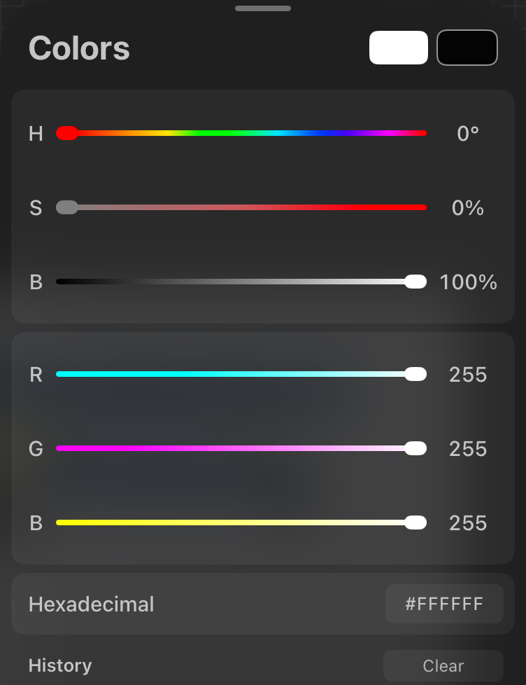
While RGB is mathematically convenient, it is not intuitive for artists. For example, if an artist wants to make a vivid red look slightly dirtier, darker, or more pastel, determining the adjustments needed across the three red, green, and blue channels simultaneously can be annoying. For that reason, there are other formats such as HSB (Hue, Saturation, Brightness), which is very popular in the art community and is also sometimes called HSV.
The Color Wheel
This change in coordinate system unwraps the RGB cube, separates direct color values into three variables hue, saturation and luminance, which align directly with perceptual characteristics and creative intent. Mathematically, it is effectively a nonlinear transformation separating the color channels into different perceptual components.
Hue
Hue represents the fundamental base color identity itself, which we can map onto the traditional 360-degree layout of a color wheel. Expressing hue gives us a method for easily defining color relationship:
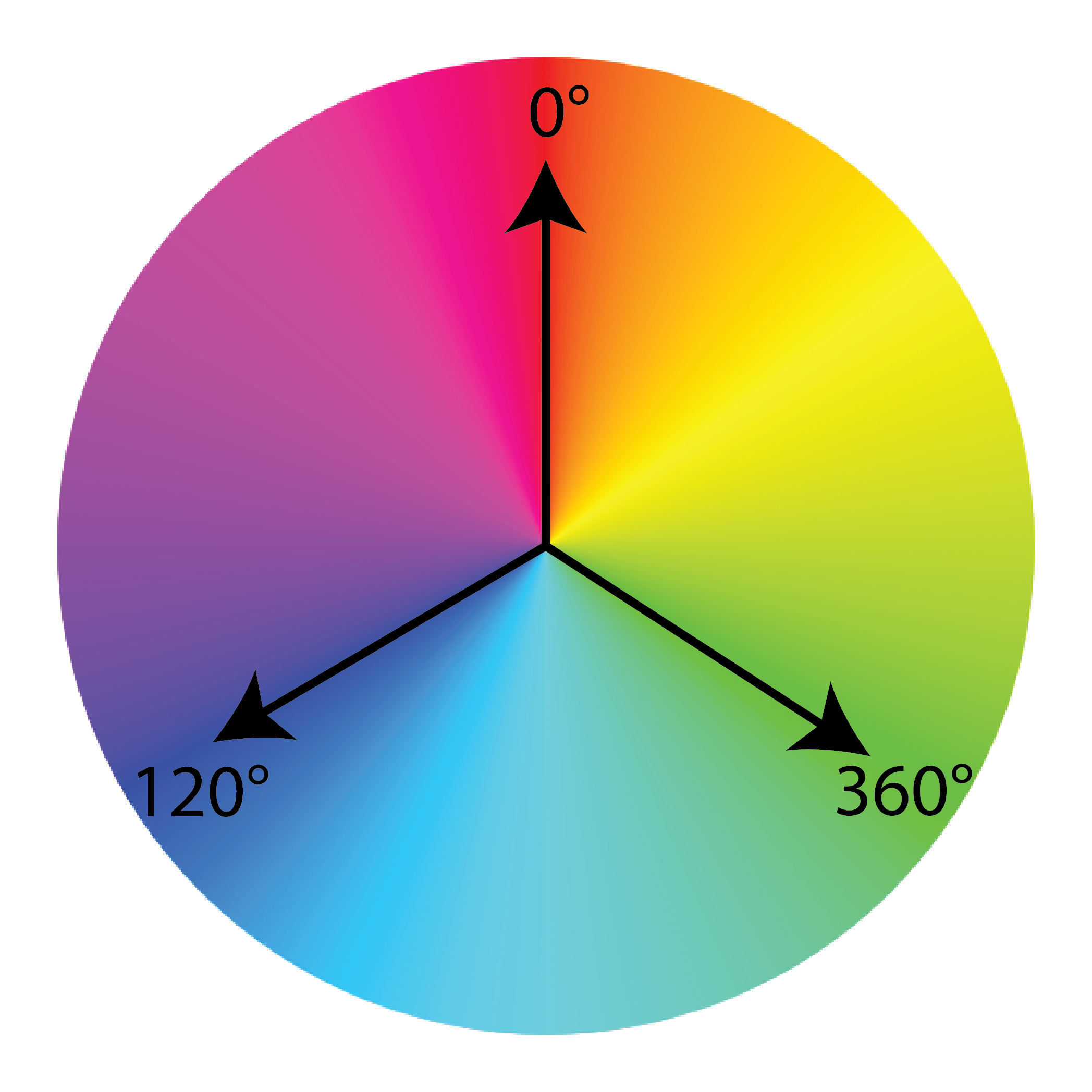
For example, the primary colors Red, Green and Blue are spaced 120° degrees apart:
- 0° = Red
- 120° = Green
- 240° = Blue
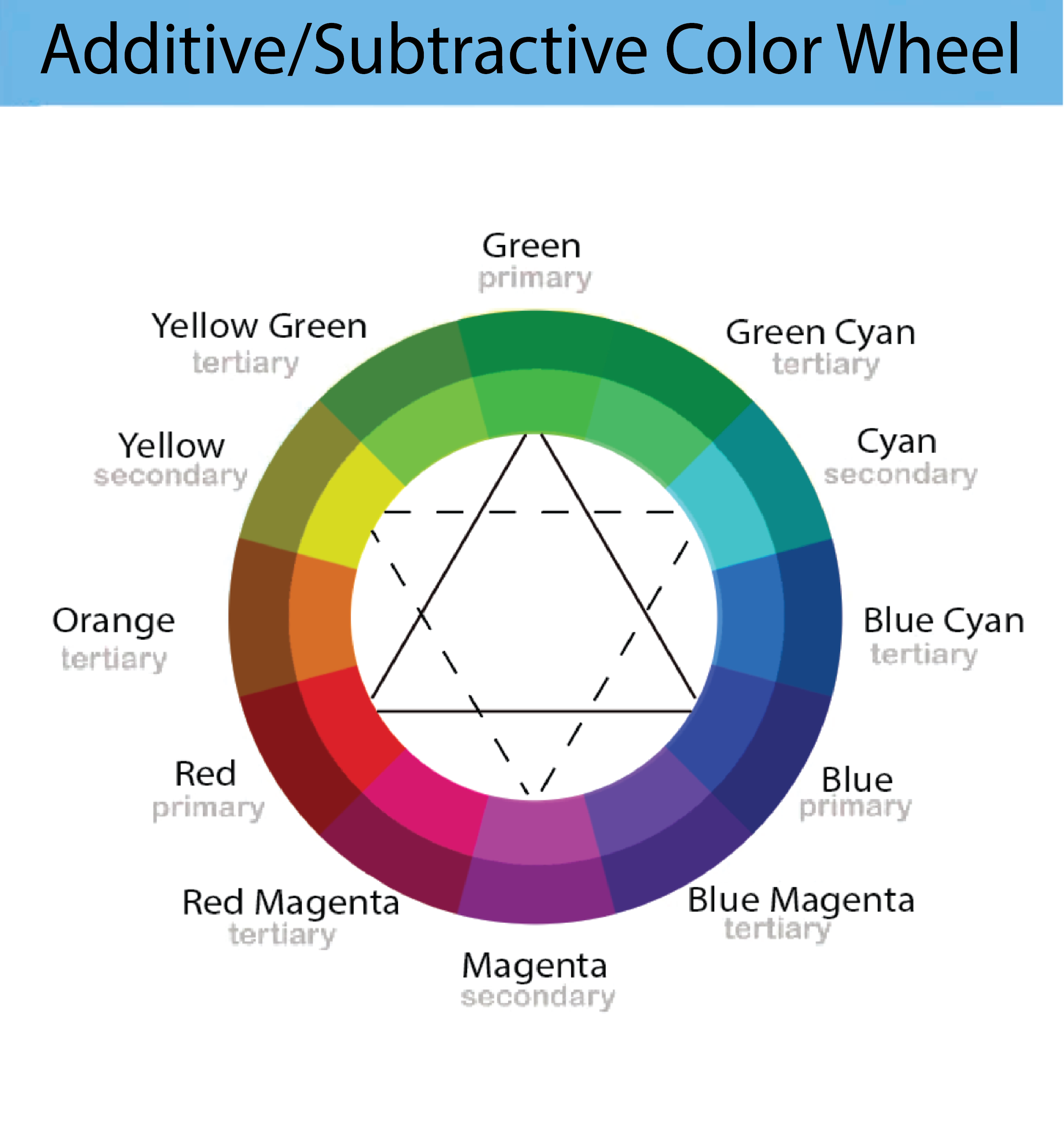
When hues are represented as degrees around a circle, calculating aspects of color harmony becomes mathematical and easy to define, many classical artistic color schemes, palettes, become simple geometric relationships. Complementary pairings sit exactly \(180^\circ\) across from one another, while triadic palettes, like the primary colors, form a perfect equilateral triangle spaced exactly \(120^\circ\). Analogous color palettes, like blue, violet and magenta, occupy neighboring regions of the wheel and typically create harmonious, unified designs. Complementary palettes maximize contrast by placing colors on opposite sides of the circle.
The geometric division of the color wheel expands beyond primary components through a process of symmetric mixing. The secondary colors, green, orange, and purple, are created by combining two primary colors in equal 1:1 mathematical ratios, establishing midpoints on the color wheel's circumference. By iterating this process further and mixing a primary color with an adjacent secondary color, tertiary colors like blue-green or red-orange can be generated. The colors of each primary, secondary and tertiary trio all sum to white. There are also split-complementary, triadic, and tetradic palettes can also be described using geometric constructions directly on the hue circle.
This is one reason that color wheels remain useful despite the availability of digital tools. They provide an intuitive geometric map that artists can use to reason about relationships between colors without having to mentally manipulate RGB coordinates. If an artist can intuitively visualize this, they can make quick, creative artistic decisions that are grounded in theory.
Saturation
Saturation measures the absolute purity and vibrancy, it also measures how far a color is from gray. In RGB terms, this relates to how unequal the components are. Mathematically, saturation is a measure of the "imbalance" between the three RGB channels.
When:
- S = 0 → grayscale When \(S = 0\), the RGB channel components are perfectly equal \(Red = Green = Blue\), mathematically this collapses the coordinate down to the central grayscale diagonal line stretching from the black vertex to the white vertex of the RGB cube.
- S = 1 → fully vivid color When \(S = 1\), the color is pushed out to the structural boundaries of the space, operating at its maximum possible vivid intensity.
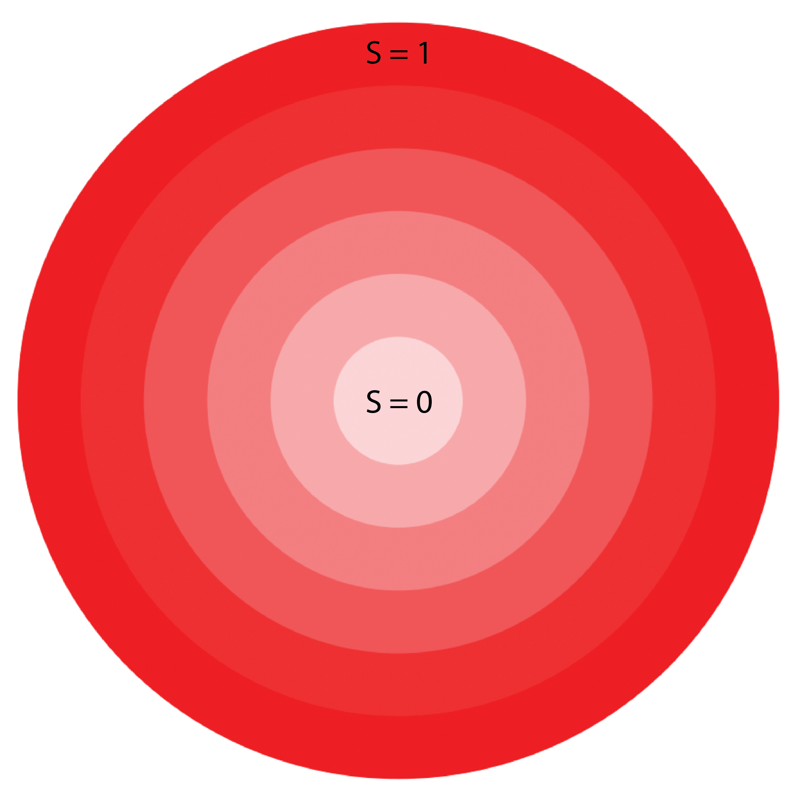
From a linear algebra perspective, saturation can be interpreted as distance from the diagonal line \(R = G = B\) in the RGB space. To make this illustration clearer, the vertices (corners) of the RGB cube are black and white as well the three primary colors and the secondary colors.
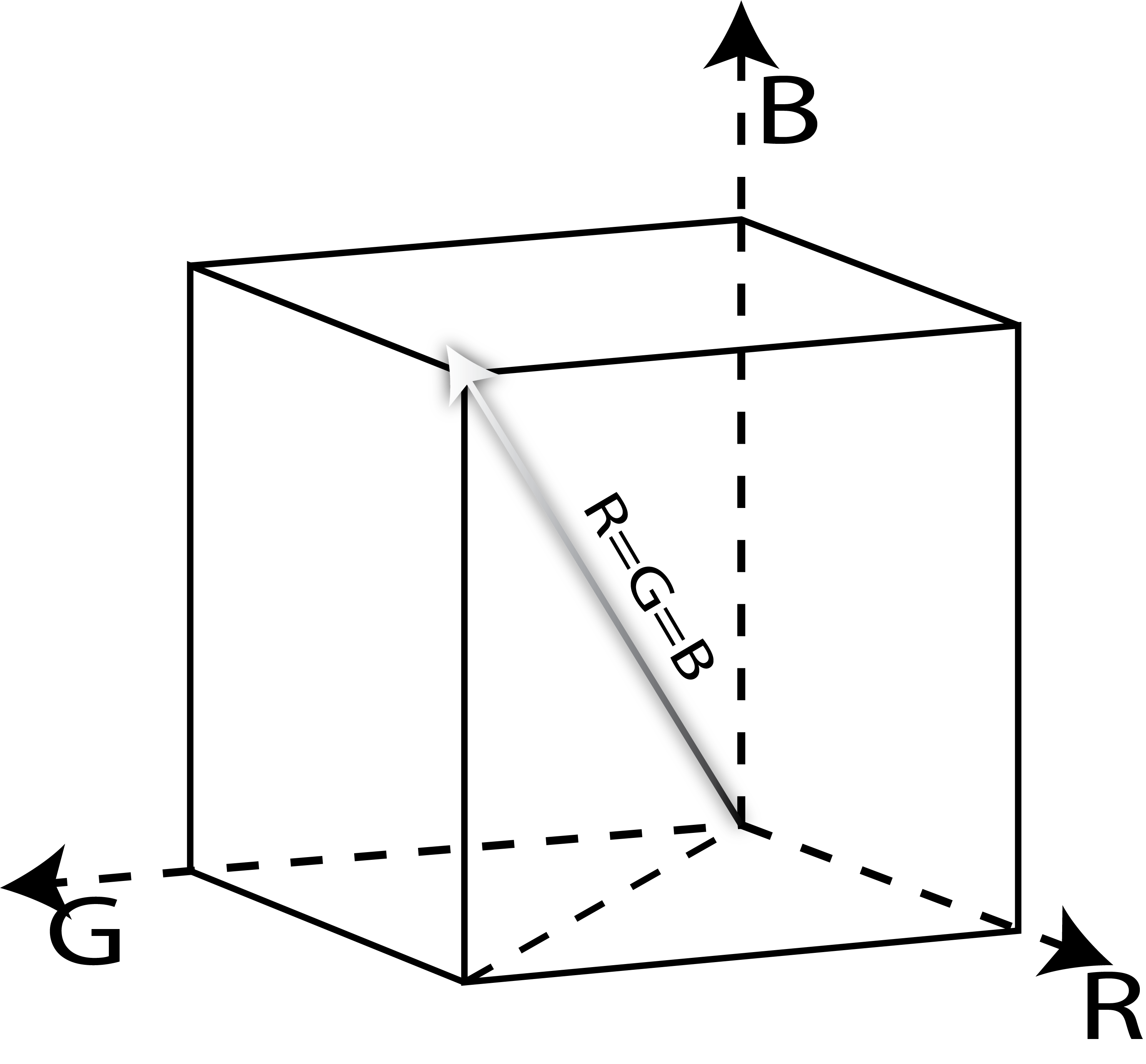
Geometrically, the grayscale axis acts as a central spine running through the RGB cube from black to white. Every pure gray value lies somewhere along this line because the three channels remain equal. As a color moves farther away from this axis, one or more channels begin to dominate, producing stronger and more vivid hues. This interpretation allows saturation to be viewed as a distance from the muted grays, black and white, rather than simply an artistic slider.
Brightness/Value
Brightness (represented as \(B\) in Photoshop or \(V\) for Value in computer science literature) tracks the overall light intensity. HSB uses a straightforward approach to determining brightness it is simply the maximum value among the three color channels:
Interactive HSB Color Mixer
The selected hue becomes the left cut plane. Saturation moves the dot outward; brightness moves it upward. Drag to rotate and pinch or wheel to zoom.
Color Theory & Mathematics
Beneath the aesthetic impact of a color palette is a rigorous architecture of mathematics, physics, and geometry. This is Color theory, it is not merely a collection of artistic guidelines, but a calculable science governed by numerical relationships and spatial logic. By analyzing color through a mathematical lens, we can precisely map the shifts of color, calculate the shifting vectors of color relativity, and partition the color wheel into distinct thermal zones of warm and cool frequencies. Understanding these concepts transforms the canvas from just a space of intuitive experimentation into a predictable system of coordinates, wavelengths, and matrices.Warm vs Cool Colors
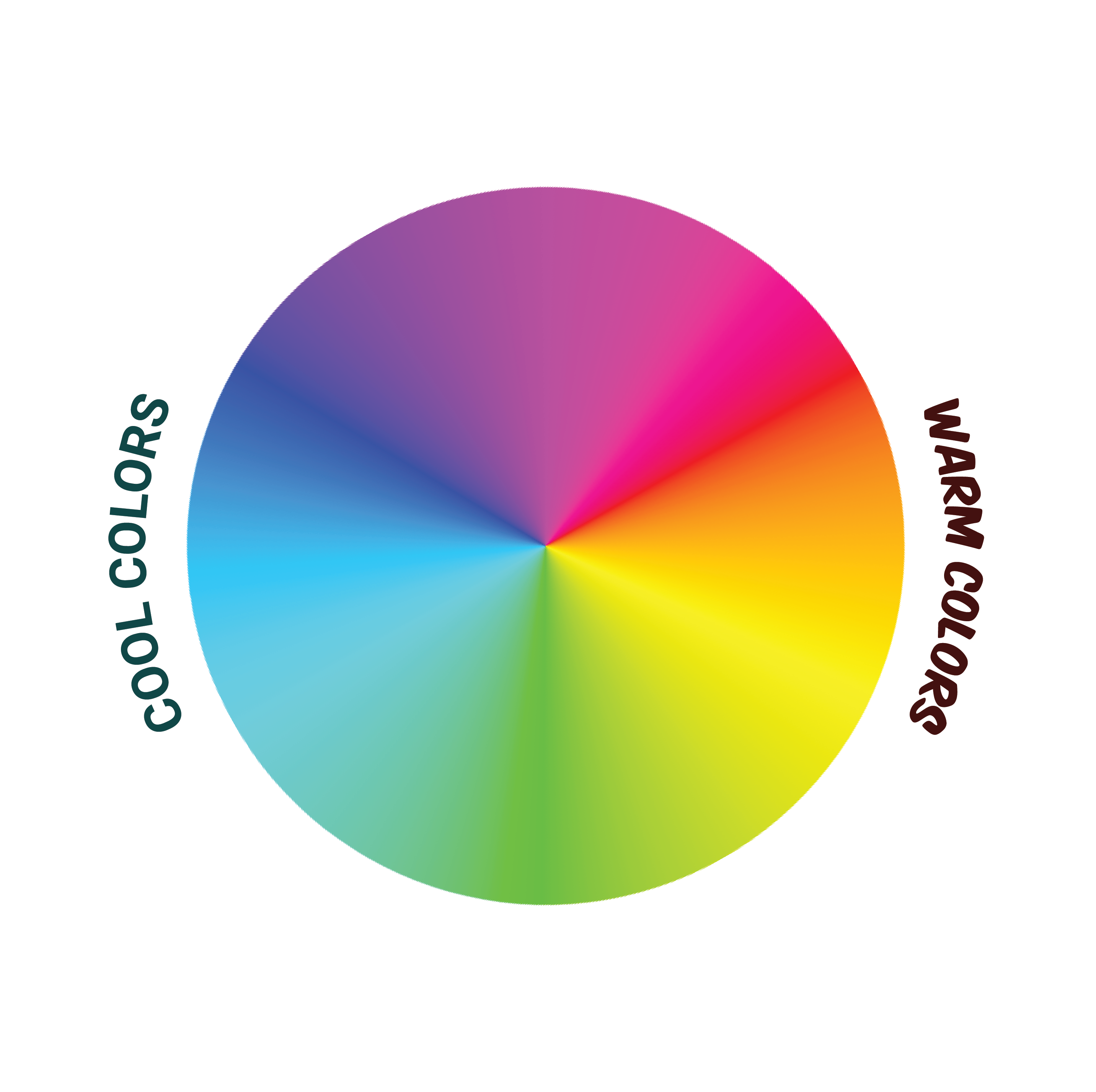
The color wheel can be split directly in half to separate what are called "warm" and "cool" colors, which evoke distinct psychological and physical sensations. Warm colors like reds, oranges, and yellows mimic fire and the sun and they make elements appear closer while stimulating energy and excitement. In contrast, cool colors like blues, greens, and purples mimic water and ice and cause elements to visually recede while promoting calm and relaxation.
<Complementary Colors
Complementary colors are pairs of hues located directly opposite one another on the color wheel. Since hue is represented as an angle, the complementary hue of a color is simply the color on the opposite side of the wheel.
\(H_{\text{comp}}=(H+180^\circ)\bmod360^\circ\)
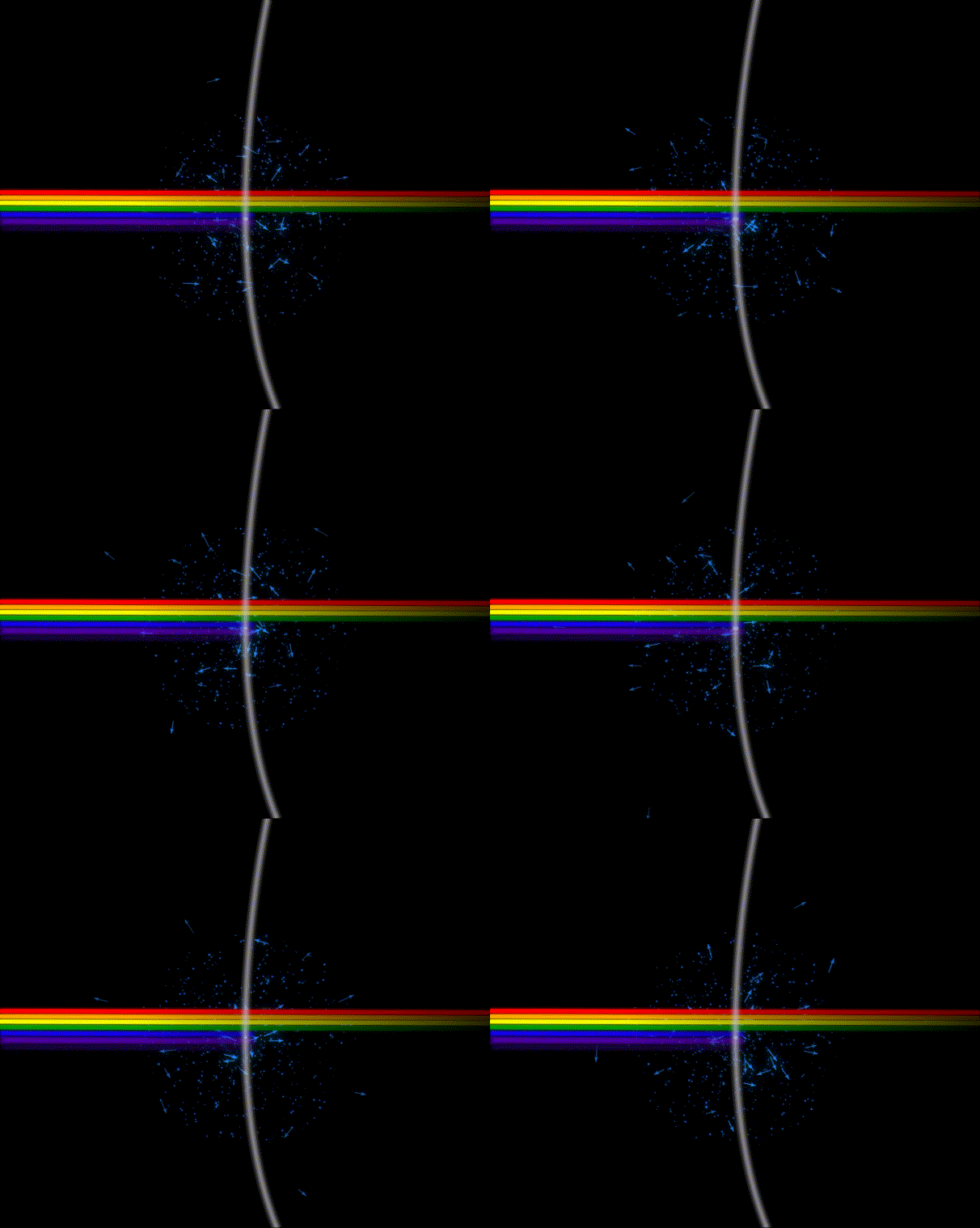
Complementary colors create some of the strongest visual contrast because they occupy opposite sides of the hue circle. When displayed next to one another, each color emphasizes the other, making both appear more vibrant and visually striking. In additive (digital) color systems, complementary colors can also be blended together. As two complementary colors approach equal proportions, their opposing hues increasingly cancel one another, causing the resulting color to move inward toward the center of the HSB color cylinder. Consequently, the saturation decreases while the perceived brightness generally increases toward white. As saturation becomes very small, hue becomes increasingly insignificant. Although a color may still be assigned a mathematical hue angle, nearly neutral colors contain so little chromatic information that differences in hue are no longer easily perceived. In other words, saturation determines how strongly a hue is expressed, while hue determines only the direction around the color wheel. For example, mixing equal amounts of red and cyan light produces white, while equal amounts of blue and yellow light or green and magenta light also approach white. In each case, the colors become progressively less saturated as their complementary components combine. The behavior of physical paints and pigments is fundamentally different because pigments selectively absorb and reflect light rather than emit it. Pigment mixing is therefore governed by subtractive color theory instead of additive color theory and will be explored in a future article on painting, blending modes, and digital art.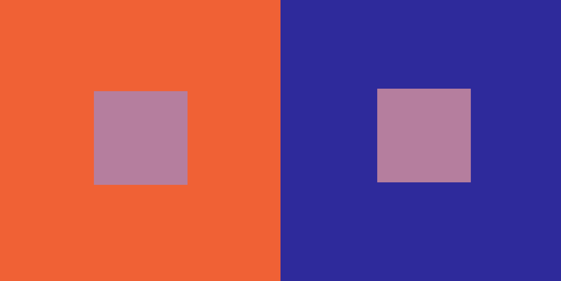
This phenomenon demonstrates that human vision is comparative. Our brains do not measure color in isolation; they continuously compare neighboring regions and adjust perception accordingly. Understanding this effect allows artists to create stronger focal points and more convincing lighting situations without necessarily changing the underlying colors themselves.
It is also important to note that color relativity translates across hue, saturation and brightness, which is another advantage of distinguishing color based on perceptual qualities. As mentioned earlier, greys appear different depending on if they are surrounded by black or white. Also, highly saturated backgrounds make colors appear muted, while desaturated surroundings amplify intensity. Similarly, color hue/temperature operates relatively as well; warm hues appear significantly warmer when juxtaposed with cool colors, and cool tones appear cooler when surrounded by warmth.
Color Interpolation
When you truly analyze every one of the common artistic adjustments, you can describe them as a mathematical operation upon data matrices. For example, blending two colors together isn't an arbitrary mixing process. We can interpolate colors by creating what is called a linear combination of two original colors; each colors components are scaled and then added together. This is how cross-fades or alpha-blending are performed, software evaluates a classic linear interpolation, smoothly shifting from one color to the other. The equation governing interpolation is defined as:
Here, the resulting color (\C\) is a linear combination, where alpha (\(\alpha\)) acts as a scalar weight scaling between 1.0 and 0.0. As alpha smoothly scales down, the color vector shifts along a straight line trajectory inside the color cube, transitioning smoothly from the starting color \(C_1\) to the destination color \(C_2\).

Color Distributions and Color Palettes
We have already explored how mathematics can add harmony and structure to color dynamics, and we can also apply this observation to color palettes, using statistics and mathematical symmetry.
A Bell curve or Gaussian Distribution, as it is called in mathematics, is the most naturally occuring statistical distribution. A distribution defines the relative probabilities of each value in a set, and if you sample you simulate choosing a value from the distribution based on its probabilities. Gaussian Distribution concentrates high probability near a central value, the mean, as we move away from the mean the probability decreases toward the tail ends. This bell-shaped curve appears throughout nature because many small independent influences naturally combine to produce a dominant central average with progressively rarer extremes.
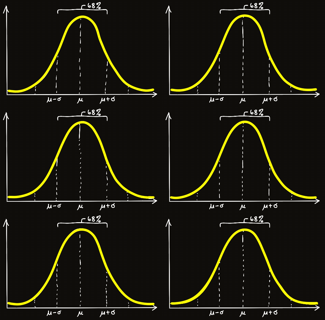
Traditionally, artists construct color palettes through intuition, experience, or established color harmony rules. However, color selection can also be approached statistically. If we interpret a color wheel as a circular coordinate system, then a probability distribution can be used to determine how frequently different hues appear within a composition. Colors near the center of the distribution become dominant, while colors farther from the center become increasingly rare. In effect, the probability distribution acts as a mathematical recipe that controls the balance, emphasis, and visual rhythm of a palette. To explore this idea, I generated a series of color studies where hue frequencies are sampled from Gaussian distributions and then projected onto structurally symmetrical grids. The resulting patterns are not painted by hand. Instead, the visual compositions emerge directly from the interaction between probability, geometry, and color theory. These experiments demonstrate how statistical structure can be translated into artistic structure.
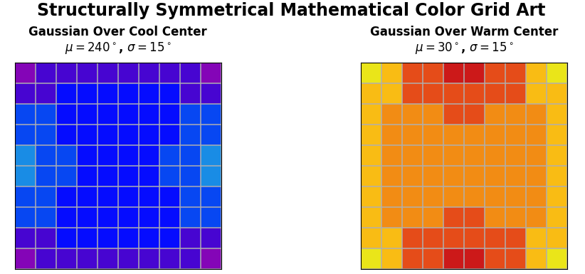
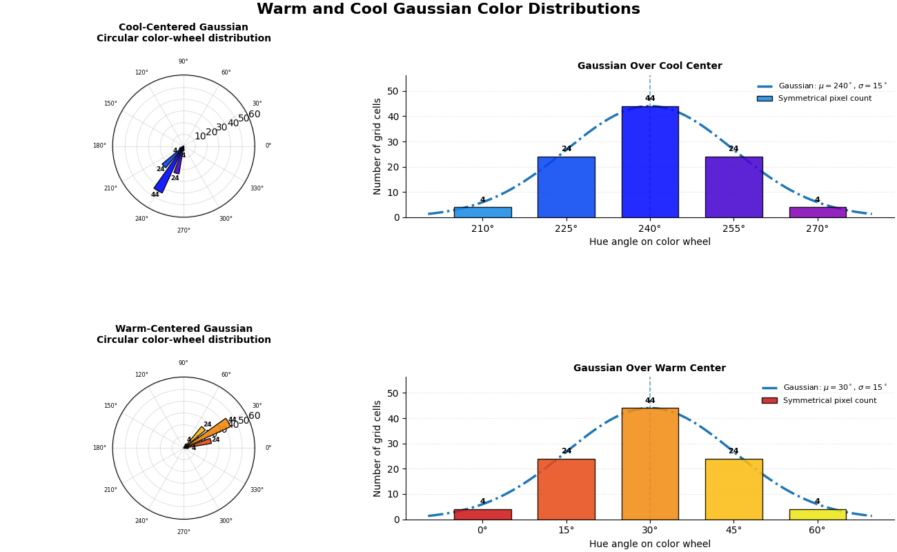
The first studies place the Gaussian center over either a warm or cool region of the color wheel. Because Gaussian distributions allocate most of their probability mass near the mean, the central hue occupies the largest area of the grid while neighboring hues appear with gradually decreasing frequency. The result is a palette that feels naturally unified because most colors belong to the same color family while still retaining subtle variation.
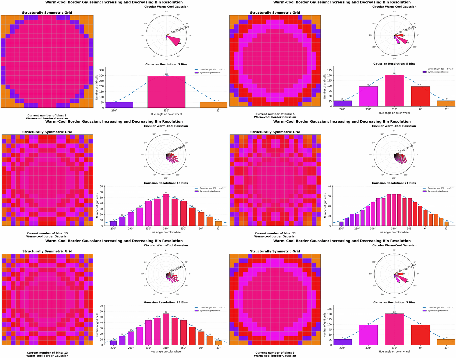
These experiments show that color palettes can be treated as mathematical distributions rather than simple collections of colors. The shape of the underlying distribution directly determines the visual character of the resulting composition. A narrow Gaussian produces concentrated palettes with strong thematic identity, while broader distributions create richer transitions and greater diversity. Perhaps the most interesting result occurs when the Gaussian is centered at the boundary between warm and cool colors. In this case, neighboring hues on opposite sides of the temperature divide begin to interact. The center of the palette becomes visually subdued as warm and cool influences balance one another, while the outer regions develop stronger contrast. This creates the impression of depth, energy, and motion despite the image being generated entirely from static mathematical rules. What begins as a mathematical structure ultimately becomes a tool for controlling visual harmony, contrast, and mood.
Color Theory & Nature
In the physical world, color escapes the pristine confines of digital code and enters a complex ecosystem of physics and biology. The hues we perceive in everyday life are shaped by the mechanics of wave optics, atmospheric scattering, and the wiring of human vision. Because natural color is a living interaction between environmental light and physiological reception, capturing it accurately requires different models of representation and analysis.Additive vs. Subtractive Systems
Digital screens rely on additive mixing of the light before it reaches our eyes, combining emissive beams of red, green and blue that mix together before they travel directly into our eyes, before color is processed through our retinas and brain. This is called an additive light.
In contrast, nature and traditional print rely on subtractive mixing, where physical pigments absorb specific wavelengths of incoming light and reflect others back to our eyes. This is a subtractive color mixing. For example, when sunlight hits a leaf, the chlorophyll molecules absorb red and blue wavelengths and reflect only green light back to our eyes. While both additive and subtractive light create color in our minds, when it comes to color mixing their dynamics are totally opposite. Additive light sums wavelengths together, whereas mixing subtractive pigments creates a color based strictly on what is left over after both pigments absorb light, the absorbing properties are summed together!
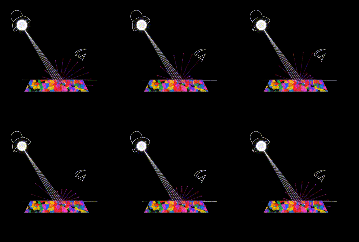
Instead of starting from black (the absence of light) and adding base components to build toward white, subtractive mixing begins with white light and strips components away. The primary subtractive pigments, Cyan, Magenta, and Yellow, each absorb exactly one primary additive color. Cyan absorbs red, Magenta absorbs green, and Yellow absorbs blue. Mixing pigments sums the absorption properties, trapping more wavelengths and driving the result closer to black. This shift in physics explains why primary colors invert when it comes to subtractive light, and it is why the color wheel is inverted for digital color and pigments. The version of the color wheel corresponding to digital color is called the Additive Color Wheel and for pigments it is called the Subtractive Color Wheel.
Subtractive Absorbance
-
White light (W) is the combination of Red (R), Green (G) and Blue (B)
- Cyan (C) subtracts only Red:
C = W - R - Magenta (M) subtracts only Green:
M = W - G - Yellow (Y) subtracts only Blue:
Y = W - B
Mixing Subtractive Primaries
Combining the wavelengths they absorb yields the additive primaries:
C + M = (W - R) + (W - G)→ BlueM + Y = (W - G) + (W - B)→ RedY + C = (W - B) + (W - R)→ Green
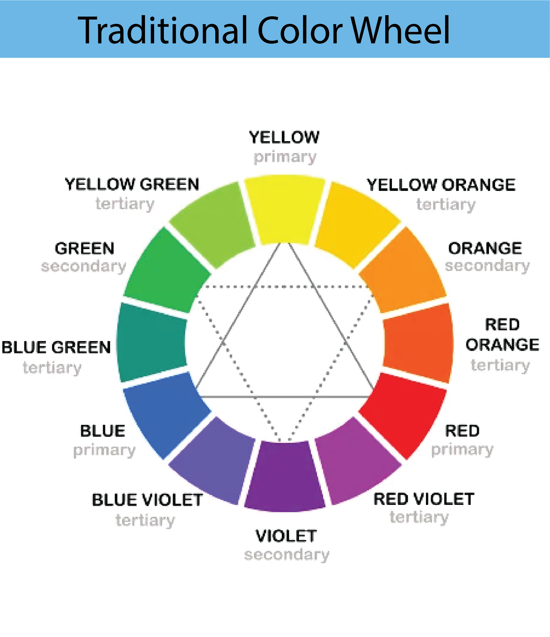
The Traditional Color Wheel
Even though we now know that the Magenta, Cyan and Yellow are the correct primary colors for pigments, originally, artists believed that this color wheel was based around red, yellow and blue as the primary colors.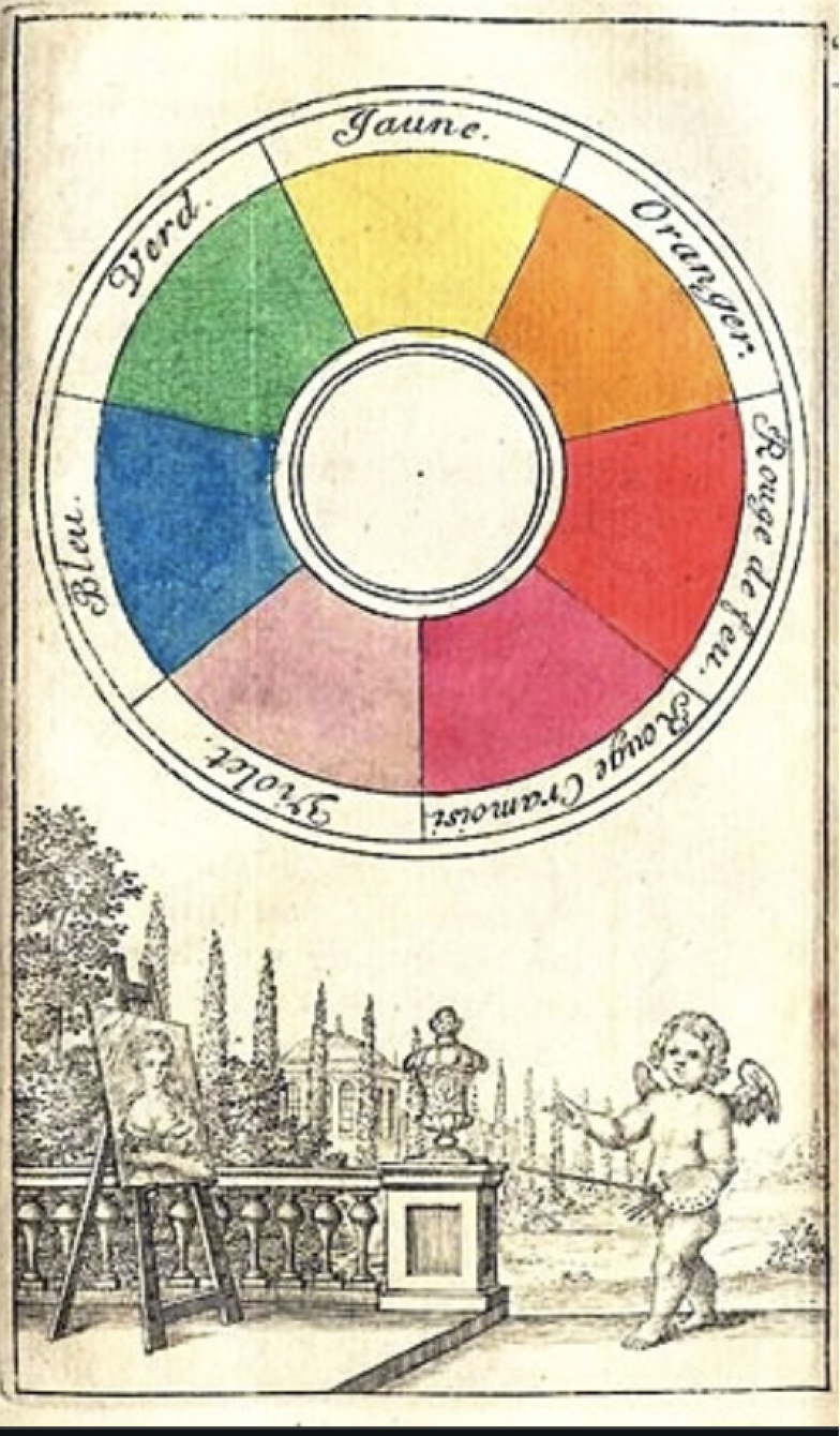
During the 1700s and 1800s, early scientists and art theorists experimented with the limited paint pigments available at the time. They discovered they could mix a broad variety of shades using red, yellow, and blue paint, mistakenly labeling them the "true" primary colors. Because centuries of art education, classic oil painting techniques, and traditional color harmony theories were built on this foundation, it remains the standard tool taught to children and used by fine artists today.
Modern color science, however, reveals that the true physical primary pigments are actually Cyan, Magenta, and Yellow (CMY). True primary pigments must absorb exactly one type of light wavelength (Red, Green, or Blue) and reflect the other two back to our eyes. Pure red and pure blue paint absorb too much light on their own. When you try to mix red and blue paint in the RYB model to make purple, they absorb almost all light wavelengths. This creates a dull, muddy plum or brown color instead of a vibrant violet. Conversely, mixing Magenta (which reflects red and blue light) with Cyan (which reflects green and blue light) allows the blue wavelengths to pass through cleanly, producing a vivid, beautiful purple. The following table breaks down exactly how these primary bases interact across different creative mediums.
| Color Scheme | Primary Colors | Secondary Colors | Tertiary Colors |
|---|---|---|---|
| Additive RGB (Light / Screens) | Red, Green, Blue | Cyan, Magenta, Yellow | Orange (Red-Yellow), Chartreuse (Yellow-Green), Spring Green (Green-Cyan), Azure (Cyan-Blue), Violet (Blue-Magenta), Rose (Magenta-Red) |
| Subtractive CMY (Modern Print / Ink) | Cyan, Magenta, Yellow | Red, Green, Blue | Vermilion (Red-Magenta), Chartreuse (Yellow-Green), Teal (Cyan-Green), Indigo (Cyan-Blue), Purple (Blue-Magenta), Crimson (Red-Magenta) |
| Traditional RYB (Art / Paint) | Red, Yellow, Blue | Orange, Green, Purple | Amber (Yellow-Orange), Vermilion (Red-Orange), Chartreuse (Yellow-Green), Teal (Blue-Green), Indigo (Blue-Purple), Magenta (Red-Purple) |
Natural Warm vs Cool Color Sources
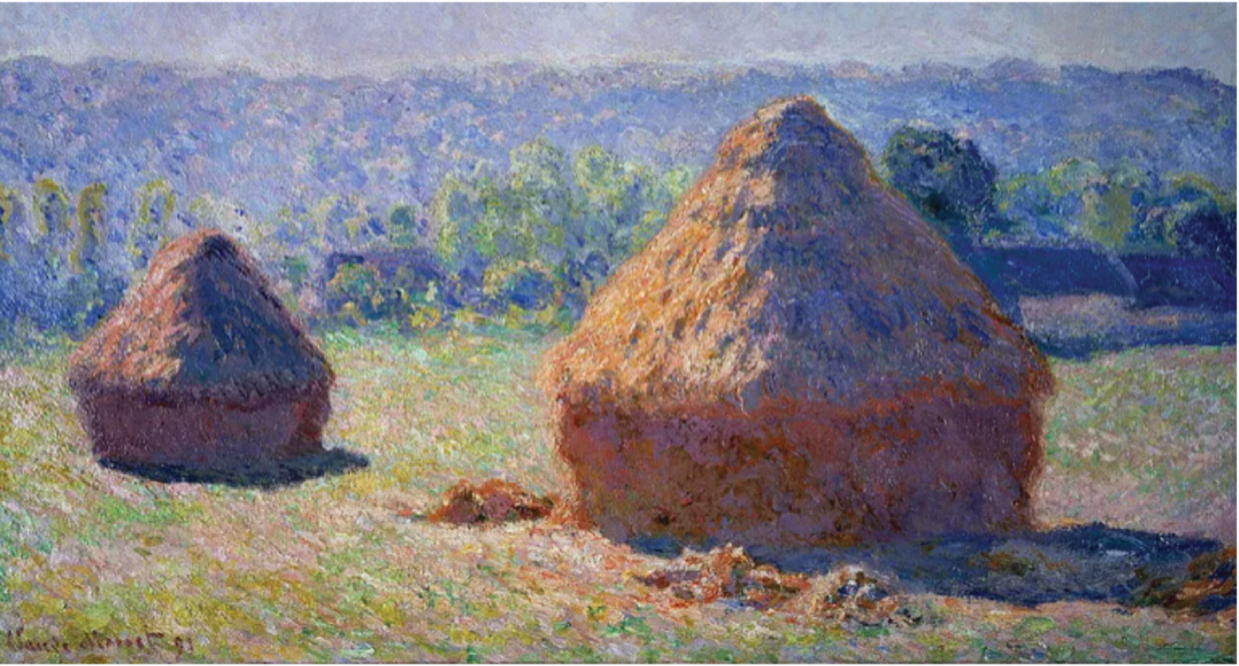
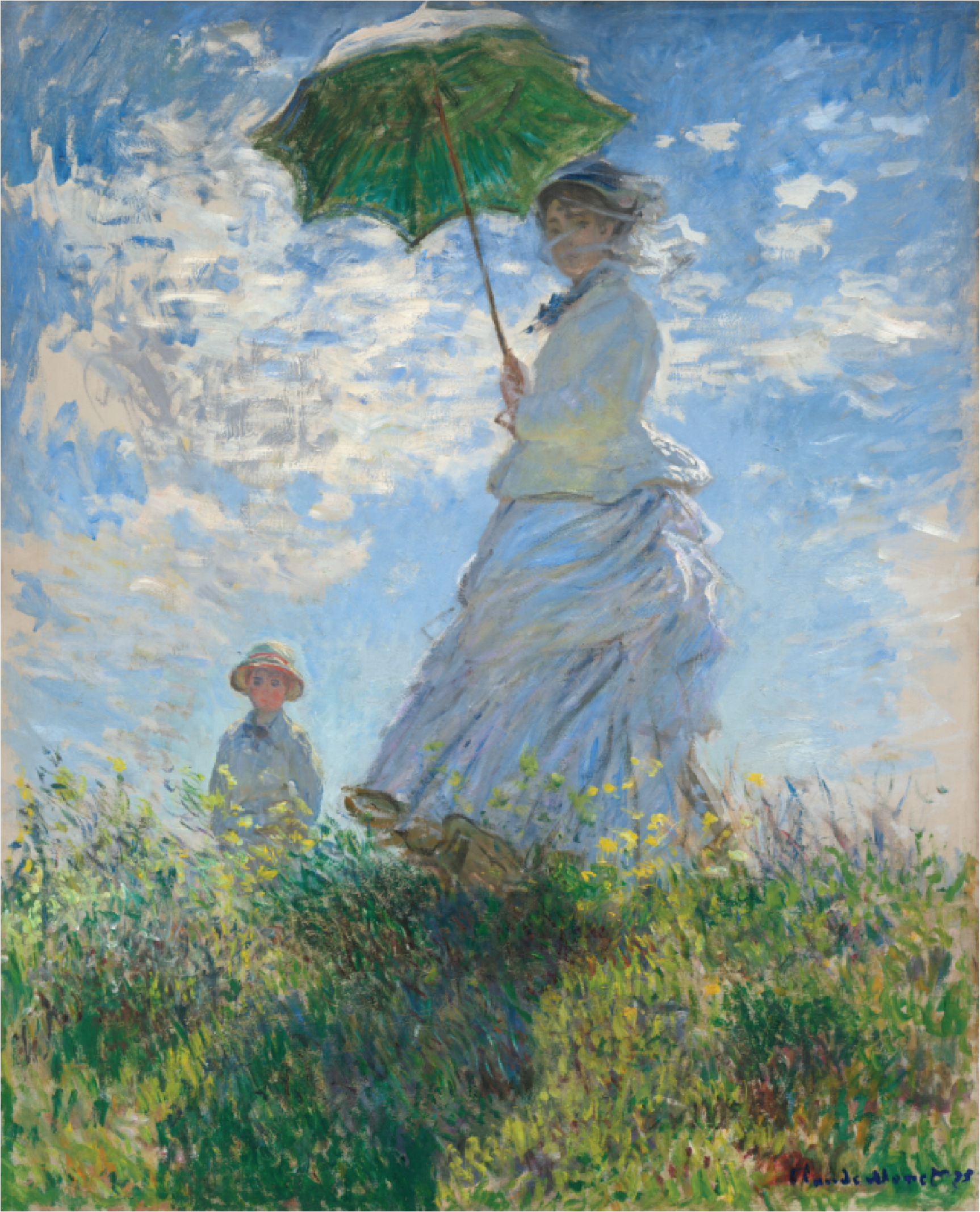
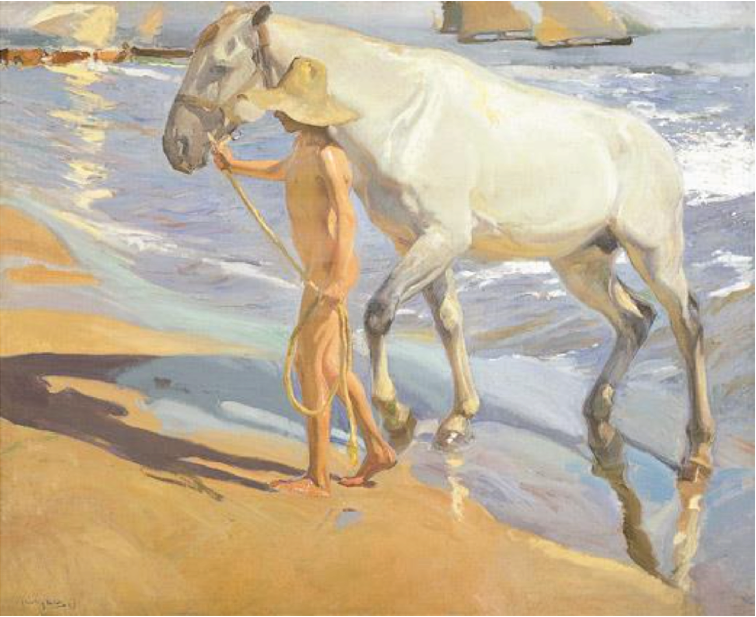
Warm and cool colors, which we discussed earlier, are not purely artistic inventions. They emerge from repeated patterns observed in nature. Fire, sunlight, incandescent bulbs, and many biological sources emit energy that appears warm. In contrast, shadows, overcast skies, water, and distant atmospheric effects tend to shift toward cooler hues. Because humans encounter these associations throughout life, they become deeply embedded psychological cues as well.
Artists frequently exploit these associations by using warm colors to pull subjects forward and cool colors to push backgrounds away. This simple principle can dramatically increase the sense of depth within a two-dimensional image. Warm colors also bring a sense of energy to a subject, while cooler colors give a sense of stillness; this is color temperature.
Importance in Design
Understanding color as a structured mathematical system gives designers a significant advantage. By transforming complex RGB coordinates into independent HSB sliders, artists can establish precise, strategic visual messages within their designs.HSB is powerful because it decouples artistic control variables:
- Hue → what color it is
- Saturation → how intense it is
- Brightness → how bright it is
Guiding Visual Attention
- High saturation - draws immediate focus to critical areas in the composition. The human brain naturally notices vivid colors first, making highly-saturated elements ideal for focal points or user-interface buttons.
- Low brightness - causes objects to recede into the background. Darker, less vibrant tones can be used to anchor framing layouts and ambient backdrops without distracting from primary elements.
- Hue contrast - creates explicit visual separation, using complementary colors side-by-side makes both elements pop cleanly against each other.
Brightness, which is often called value by artists, is what creates structure and reality, as brightness values are affected by the form and structure of the world. Then, color identicates identity and mood. If we master the structure of light and dark first, we are free to use color as an independent layer of pure emotional storytelling. This is why art teachers often say "the value does the work and color gets the glory." A painting with perfect colors will fail to accurately represent the subject or present a message if the values are wrong, yet paintings with a solid value structure will generally succeed.
Over the course of history, different colors have taken on different meanings across cultures psychologically Thus, as designers we can also imbue a scene or character with emotion or a theme using hue and saturation, where hue controls the color and saturation is like an intensity of this feeling or emotion that it produces. For example:
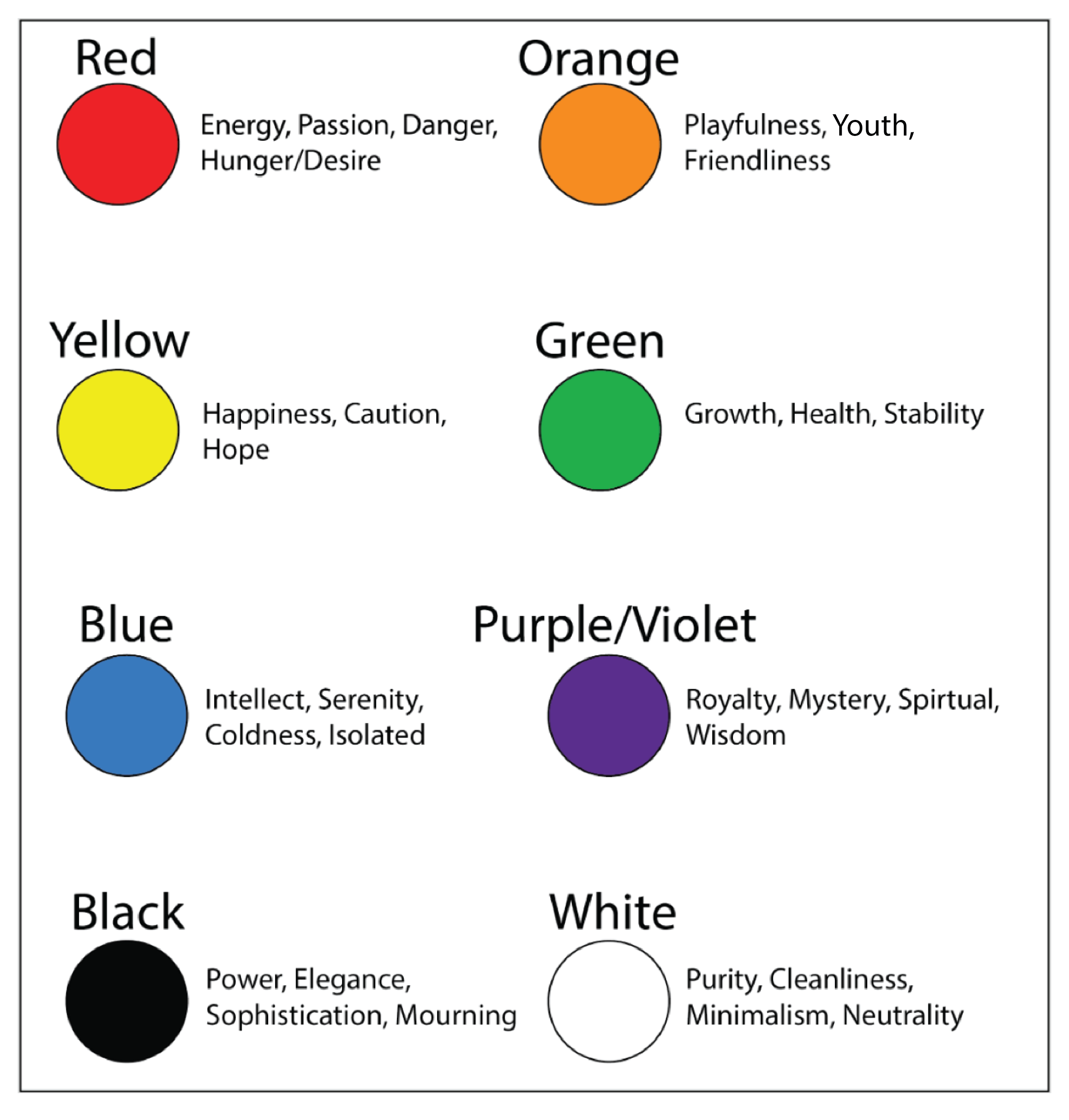
Ultimately, understanding color as both an artistic and mathematical vector gives you more control. Instead of relying on only your artistic visual intuition you can also use patterns and geometry to guide your color choices.
Visual Balance
Visual balance describes how the visual weight of colors, shapes, and objects is distributed across a design. Two objects may occupy the same amount of physical space while still attracting dramatically different amounts of attention. A small, vivid yellow shape may visually compete with a much larger dark-blue region because yellow generally appears brighter, more active, and easier for the eye to detect. Color has its own form of visual weight. This weight is influenced by hue, brightness, saturation, temperature, contrast, and the surrounding colors.
Under equal conditions of size, saturation, and surrounding contrast, colors can be loosely ranked according to how strongly they attract visual attention:
- Yellow
- Yellow-Green
- Orange
- White
- Red
- Cyan
- Green
- Magenta
- Blue
- Violet
- Black
This ranking should not be interpreted as an absolute law. A color's visual importance changes with context. Black may appear visually quiet against a dark background, but a small black shape placed inside a pale-yellow field can become an extremely strong focal point. Likewise, a muted yellow may attract less attention than a highly saturated blue. The ranking is most useful as a starting model for understanding how hue and perceived brightness influence visual weight.
Yellow and yellow-green usually appear near the top because the human visual system is highly sensitive to light in this region of the visible spectrum. Orange and red also carry strong visual energy because they are warm colors and are frequently associated with fire, heat, warning, and movement. Blues and violets typically appear darker and more distant, giving them less visual weight unless they are strongly saturated or placed against a contrasting background.
The Seven Color Contrasts
The artist Johannes Itten described seven major forms of color contrast. Each contrast isolates a different relationship between colors and provides a method for controlling hierarchy, balance, rhythm, and emotional intensity.
- Contrast of Hue – occurs when clearly different hues are placed next to one another. The effect is strongest between distinct primary or secondary colors, such as red, yellow, and blue.
- Light–Dark Contrast – separates colors according to brightness or value. White against black produces the strongest possible value contrast, while lighter and darker versions of the same hue create depth and structure.
- Warm–Cool Contrast – places warm reds, oranges, and yellows against cool greens, blues, and violets. Warm colors tend to advance while cool colors tend to recede.
- Complementary Contrast – occurs between colors positioned opposite one another on the color wheel. Examples include red and cyan in an additive model or red and green in a traditional artistic model.
- Simultaneous Contrast – describes the way surrounding colors alter perception. The eye tends to generate the impression of a complementary color around a hue, causing identical colors to appear different in different environments.
- Contrast of Saturation – compares vivid, pure colors with muted, gray, or desaturated colors. A highly saturated accent placed inside a neutral composition can become a powerful focal point.
- Contrast of Extension – concerns the relative quantities or areas occupied by different colors. A visually strong color may require only a small area to balance a much larger region of a visually weaker color.
Contrast of extension is especially important for visual balance because colors do not need to occupy equal areas to feel equally important. A small yellow region can balance a much larger violet region, while a bright orange accent can balance a broad field of dark blue. The composition becomes balanced when the visual forces feel stable, not necessarily when the shapes are identical or symmetrically arranged.
Visual Storytelling
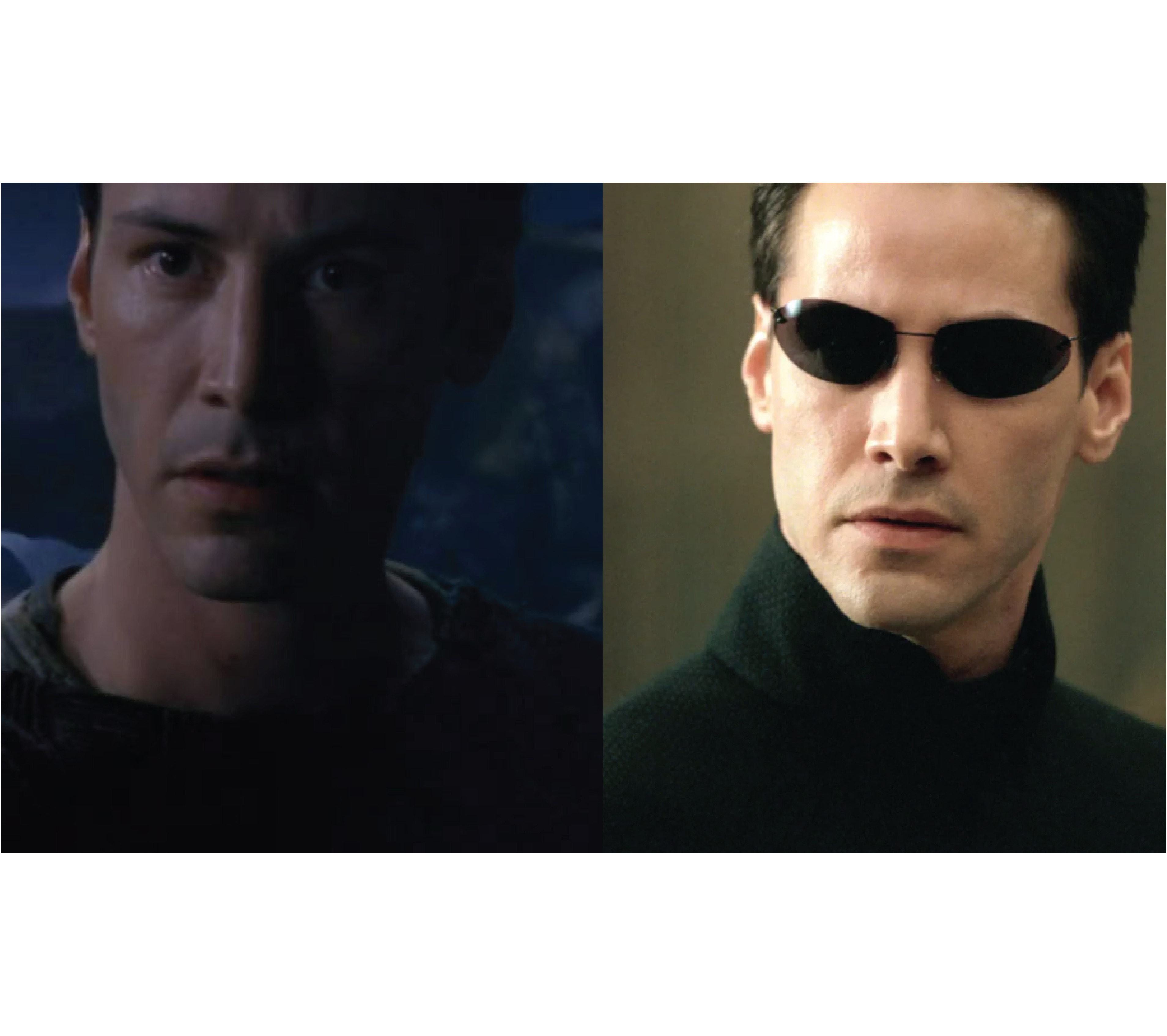
Because distinct hues trigger specific psychological associations, artists can use different color grading choices to establish an overall mood or thematic message. One famous cinematic example of this technique is found in The Matrix. The filmmakers applied a heavy green tint to every scene taking place inside the digital simulation, the Matrix, creating an uncomfortably artificial, sterile environment, like a scientific lab. In contrast, scenes set in the real-world city of Zion were color-graded with a distinct, heavy blue tone. Blue tones are more natural to real-world environments, so these scenes were more grounded in reality but also cold and harsh.
Another example of visual storytelling is the branding of some of the most popular fast food restaurants. Most of these companies design their brand logo using red as it speaks to desires, one of which is hunger. Some brands also use yellow to give the restaurant a friendly atmosphere and some blue to establish trust. However, the sheer amount of red within these logos is no coincidence.

Character Design
Color can be used as a foundational storytelling tool. Because of the psychological associations that we have with color, certain palettes and contrasts can automatically imbue characters with personality, morality, and emotion. Different palettes, and contrast can also be used to make characters pop, guide the viewer's eye, and ensure visual distinction.
In addition, Character designers often use geometric arrangements on the color wheel to establish relationships between different characters. In the Sonic the Hedgehog universe, the primary character designs form an almost perfect clean color wheel layout:

This geometric arrangement visually anchors the primary cast, using distinct color relationships to reinforce their contrasting personalities and balanced roles within the story.
Conclusion
Ultimately, understanding color as an element of language in both art and mathematics provides unparalleled creative control. Instead of relying solely on visual intuition, you can utilize patterns, geometry, and equations to make precise, impactful design choices that place messages and anchors within your compositions.
Thoughts?
If you have questions, corrections, or ideas for future articles, reach out through Instagram(@makermeezy), Youtube(@makingzeniths) or Email(makingzeniths@gmail.com)
Comments